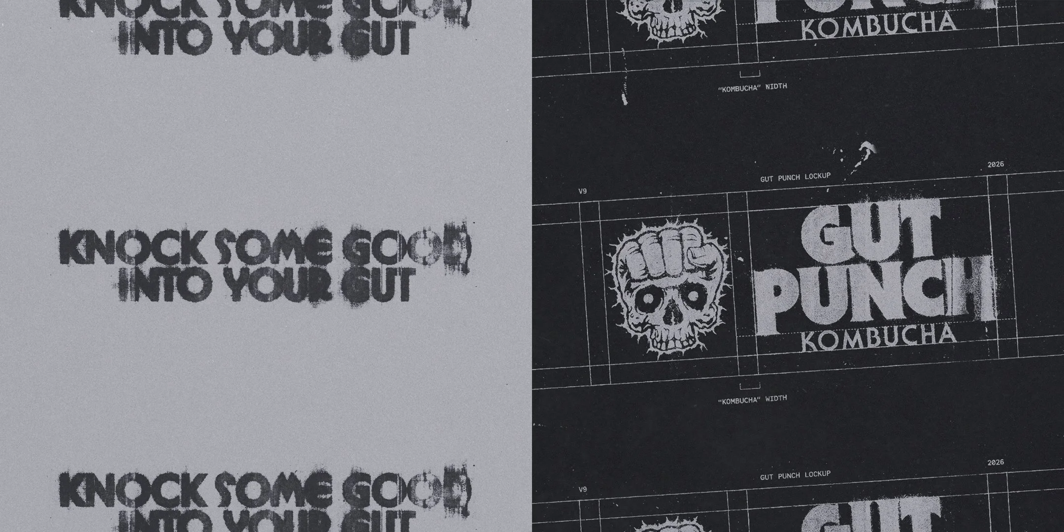
Gut Punch
Kombucha
Knock Some Good
Into Your Gut.
Picture your average kombucha drinker. You're probably thinking of a coastal yoga girl or a hippie Pacific Northwesterner, right?
The data says you're spot on: over 65% of the market is female, eco-conscious, and hyper-focused on health. Unsurprisingly, the kombucha industry has modeled its entire visual language around this demographic. Walk down the kombucha aisle today, and you're swimming in a sea of mandalas, lotus flowers, and soft pastel minimalism.
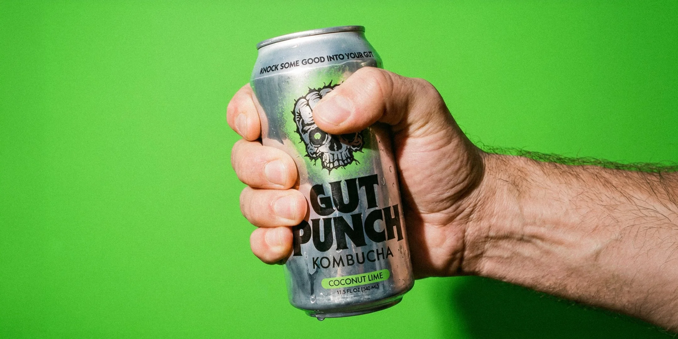
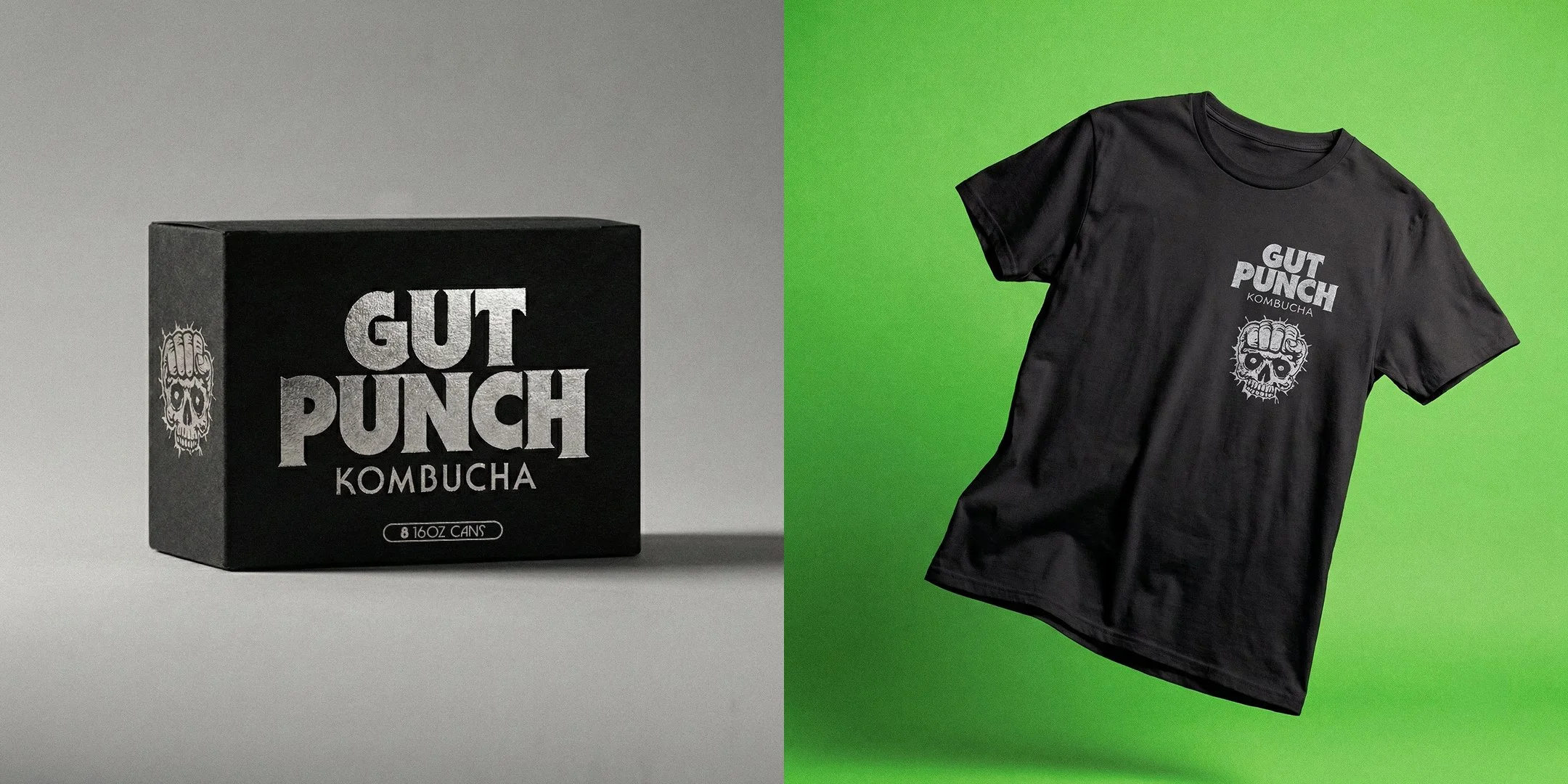
Enter Gut Punch Kombucha. A brand built to shatter the earthy, female-centric conventions of the category through its bold ethos and packaging.
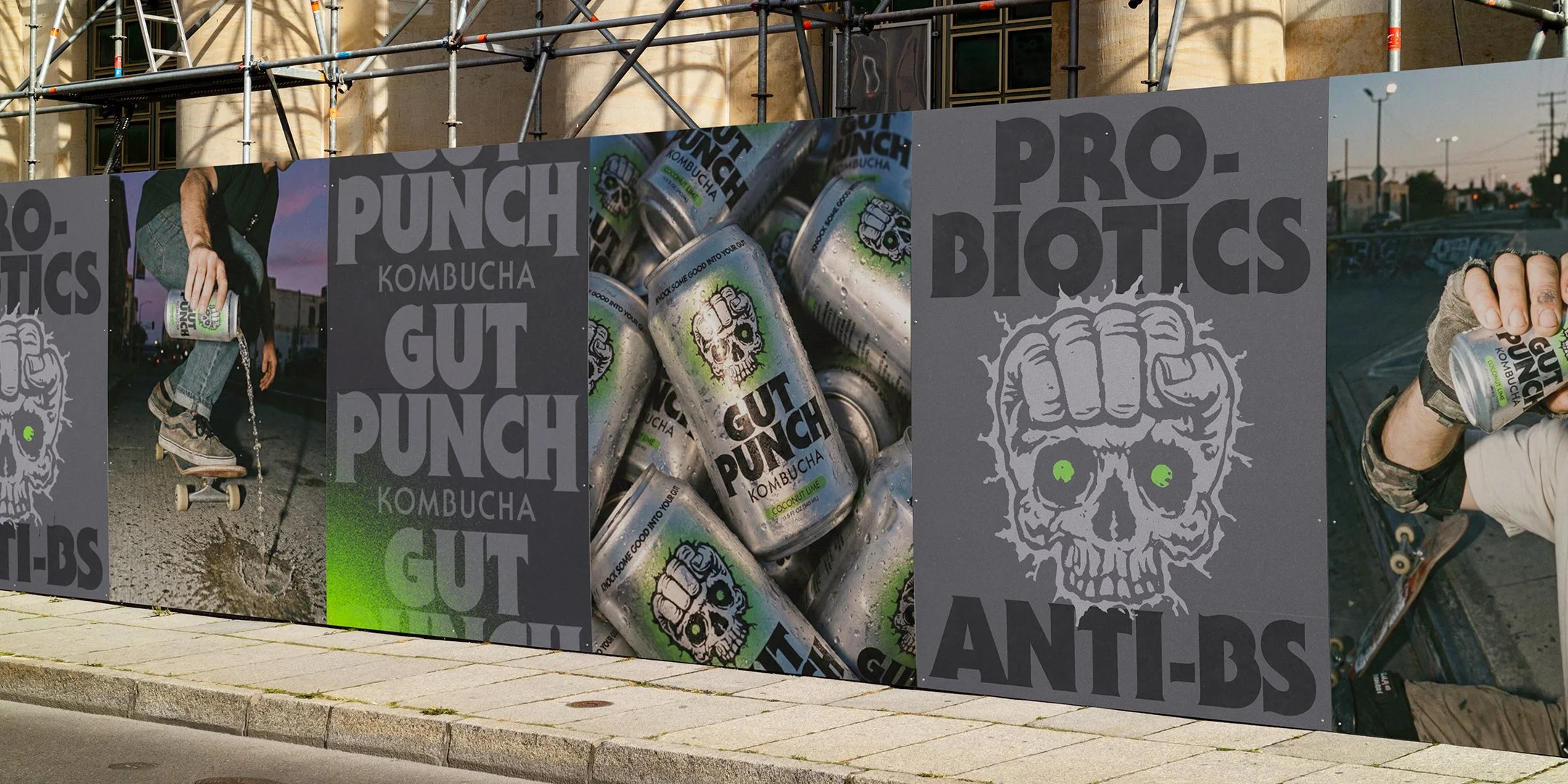
Pro-Biotics. Anti-BS.
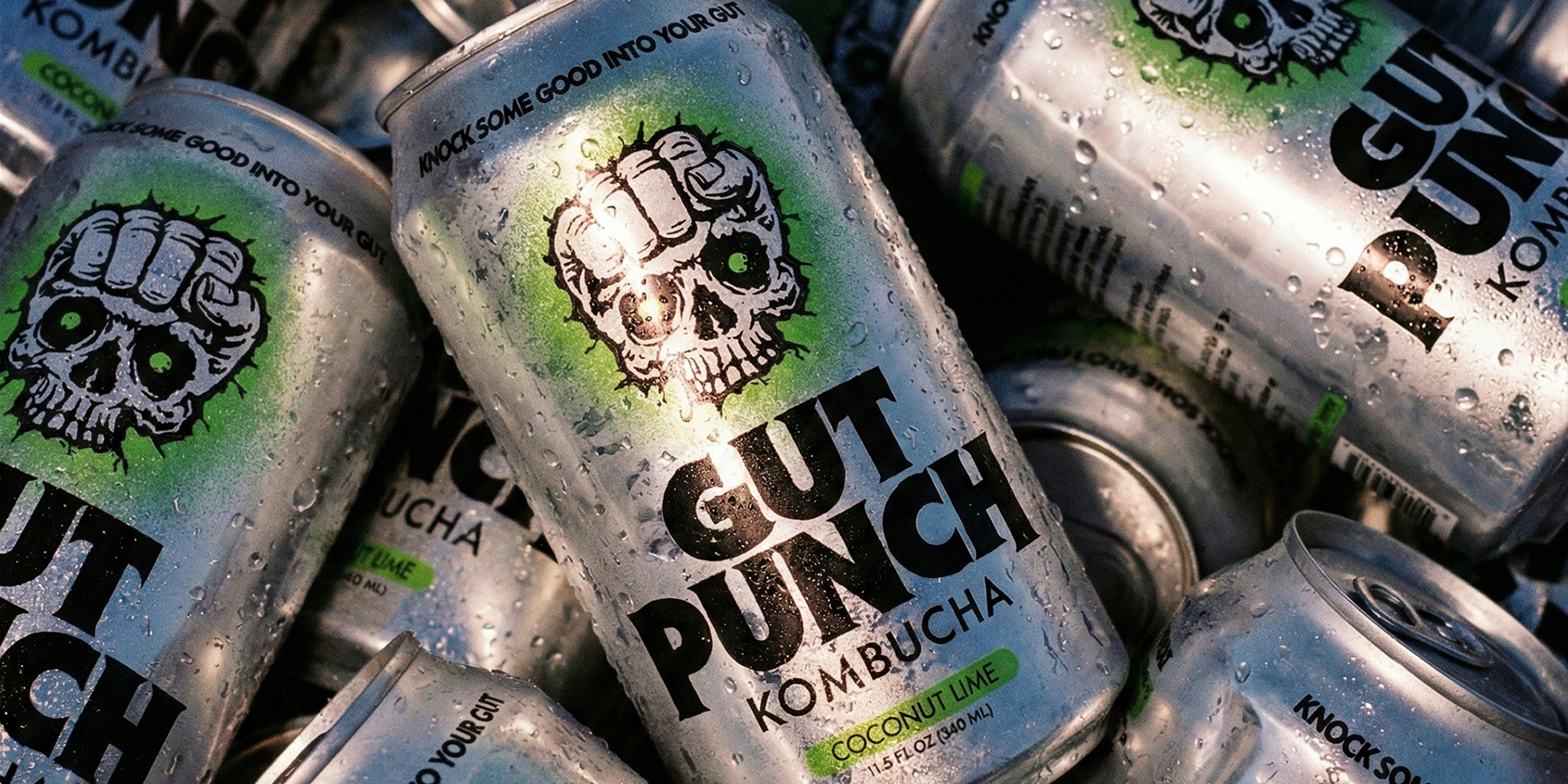
To bring this brand to life, we crafted a gritty "skull-fist" logo that aggressively punches through a sea of serene, pastel bottles. The design blends vintage rock typography, vivid spray-painted color splatters, and exposed aluminum for an uncompromising mosh pit aesthetic. Rather than relying on quiet wellness jargon, our bold copywriting cuts straight to the point, encouraging drinkers to "knock some good into their guts." The result is a metal-forward package built to redefine who drinks kombucha.